Self-Directed Brand Identity — 2025
Di Kala Topi
Chicken tikka masala is Scotland's national dish. Angus beef is Scotland's finest export. Kala Topi is the restaurant that stopped arguing and started cooking.
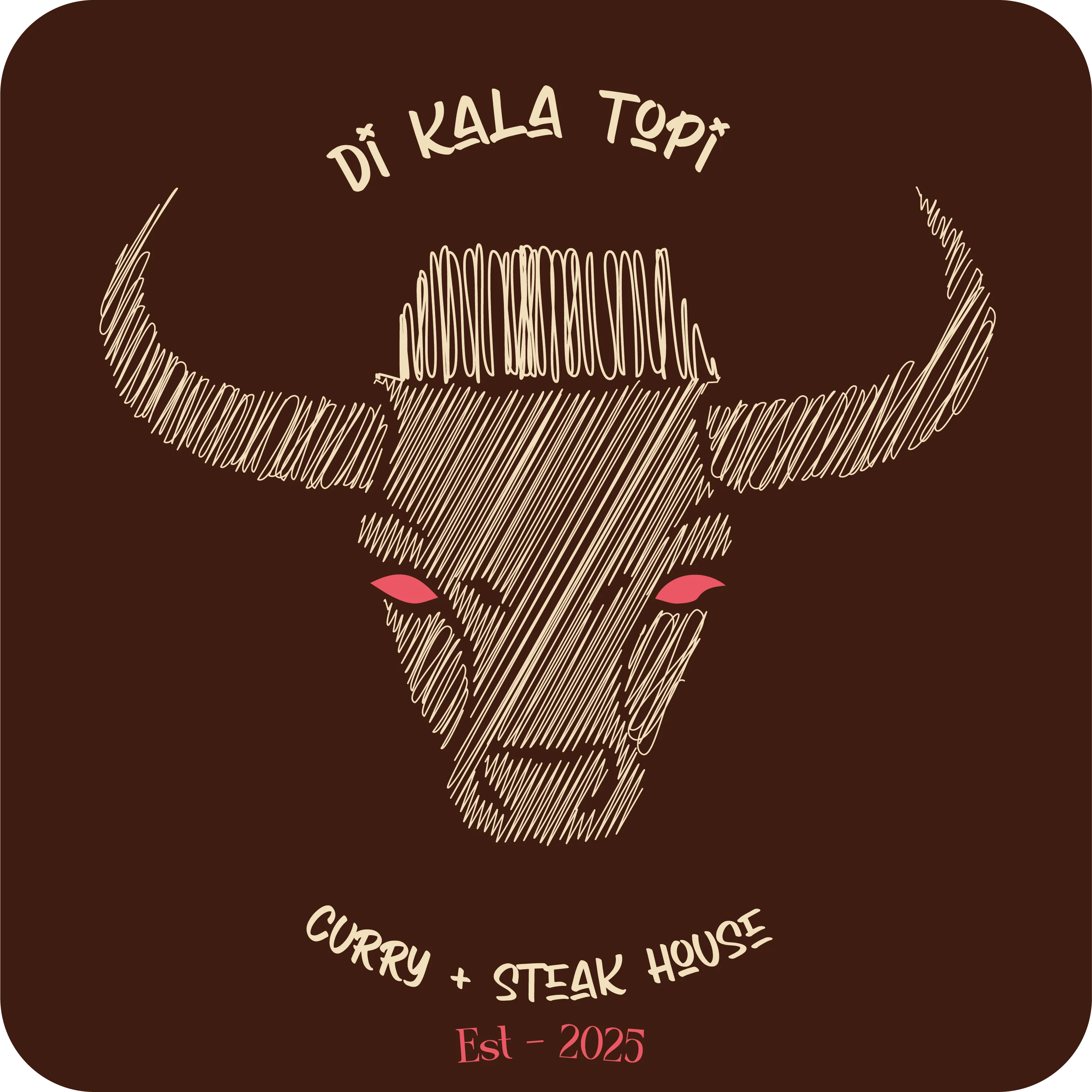
Self-Directed Brand Identity — 2025
Chicken tikka masala is Scotland's national dish. Angus beef is Scotland's finest export. Kala Topi is the restaurant that stopped arguing and started cooking.
The problem
Scottish-Asian restaurants get branded as novelty — "fusion", "east meets west" — language that diminishes both heritages.
What I made
An identity that treats the hybrid as the point, held at fine-dining register rather than played for novelty.
The Premise
For second and third generation Scottish Asians, this tension between heritages isn't a problem to solve — it's the texture of daily life. Kala Topi is designed for the professional who orders a dram and a karahi without having to explain either. For the Barclays Christmas party where everyone, regardless of background, finds something that feels like home.
The brief was self-directed. The subject is personal. The design challenge was to make something that honours both heritages without diminishing either — and to do it with enough sophistication that it reads as fine dining, not novelty.
The Productive Tensions
Material
Angus Beef × Pakistani SpiceTraceable Scottish farms. Four-generation family spice suppliers. Neither compromises the other.
Visual
Hand-Drawn Warmth × Fine Dining PrecisionSketch illustration and texture against clean type hierarchy. The roughness is intentional — craft over polish.
Cultural
Scottish Heritage × Kashmiri RootsNot fusion for novelty. The natural culinary evolution of two communities sharing one city for sixty years.
The turn
Treating the two heritages as a collision is what produces novelty branding. Treating them as the natural culinary evolution of two communities sharing one city for sixty years produces something else entirely — and it decides everything downstream. It is why the voice refuses "east meets west", why the beef is traceable Scottish farms and the spice comes from four-generation family suppliers, and why the roughness in the illustration is craft rather than polish.
Messaging
Knowing what you won't say is as important as knowing what you will.
We say
"Where Angus meets spice tradition"
"Halal excellence. Scottish roots."
"Crafted at the intersection of heritage"
"Premium cuts, timeless techniques, bold flavors"
"Quality is a relationship. We know our suppliers by name."
We never say
"Exotic fusion" (othering language)
"East meets West" (reductive)
"Traditional with a twist" (diminishing)
"Authentic Pakistani" alone — we're proudly hybrid
"Fast meets West" (reductive framing)
Visual Identity
Every colour is an argument. None are decorative.
The Table Setting
A brand that can be held. Three ceramic pieces in multanni mitti and British stoneware — the same material collision as the menu, made physical.
Where it landed
A speculative project, and still open — there is no trading restaurant behind it and no commercial result to report. What exists is the system: the name and mark, the voice with its refusals written down, the menu structure, the colour system, and a set of made objects that put the identity onto something you can pick up.
What it unblocked
The voice section is the part that does the work after I leave. Anyone writing a menu, a sign or a social post for this brand has the five things to say and the five to never say, with the reason beside each — so the hardest judgement call on the project, how to talk about two heritages without diminishing either, is already made.