Full Brand Identity · Web · Vehicle Livery — 2024

Clydeside
Logistics

Clydeside needed to be seen at 60mph. Restraint was never the brief.

Client

Clydeside Logistics Ltd

Sector

Courier & Logistics — Glasgow

Scope

Brand Identity · Web Design & Build · Livery · Stationery

Site

clydesidelogistics.com

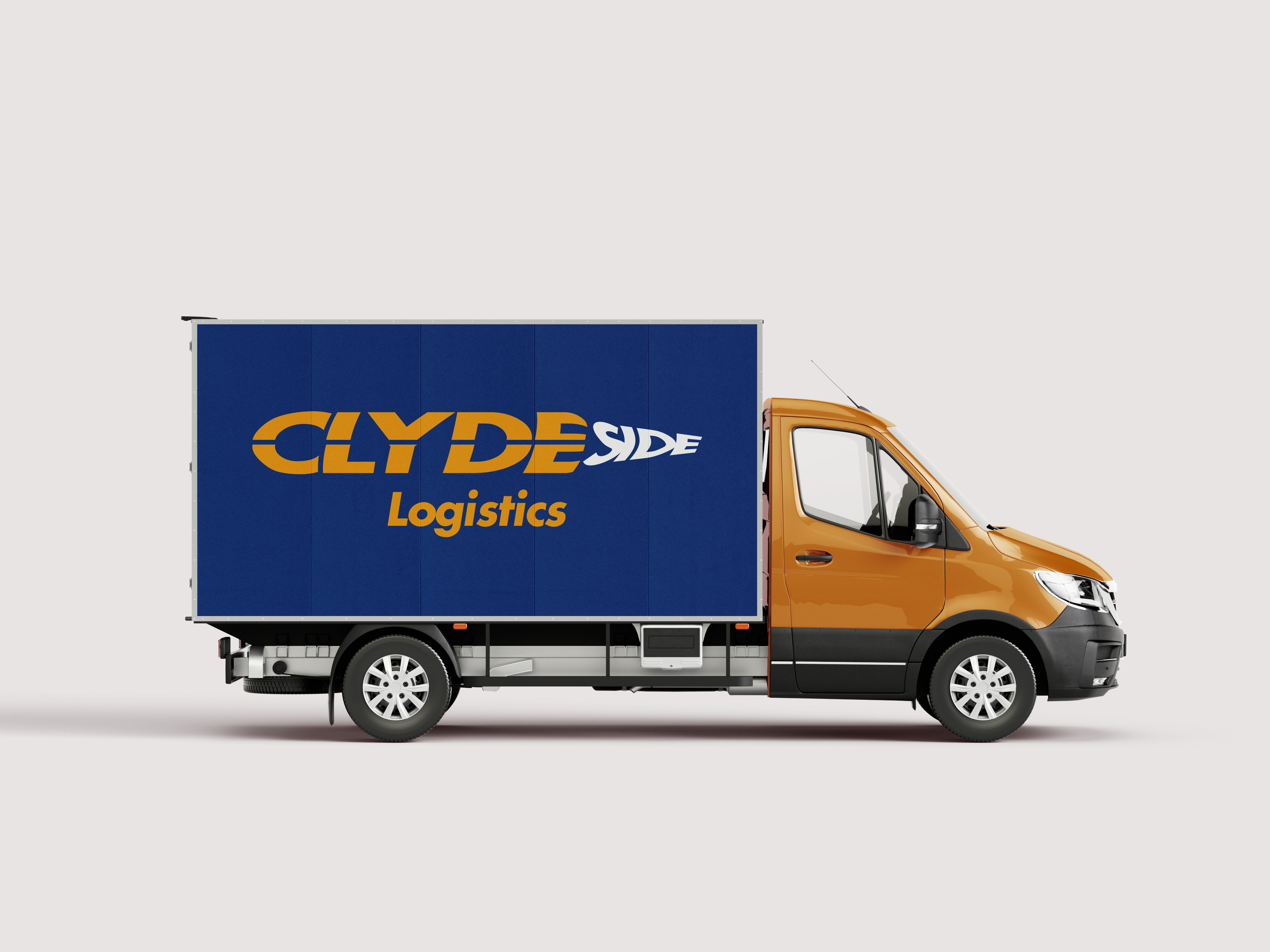
Clydeside Logistics is a Glasgow-based courier and logistics company operating across Scotland and the United Kingdom. They came to SCM Design Studio with no brand identity — just a name and a fleet of vans. Everything needed to be built from nothing: the logomark, the system, the site, the stationery, and the vehicle livery.

Logistics branding almost always lands in one of two camps. Corporate and forgettable - the kind of navy and silver identity that disappears into every other white-van operator. Or aggressive and cheap — sticker-pack fonts and clip-art lightning bolts. Clydeside needed a third option: bold, and confident, without being either pantomime or bland.

The brief was also practical. A brand that lived on a van had to work at distance, at speed, in all weather. The mark needed to be identifiable at 60mph on the M8 before it was legible at 6 inches. That constraint drove every decision.

1000+

Daily Impressions - Average of 250 views per van daily

4

Vans, livery ready and deployed for on road marketing

18

Booking in first 6 weeks post-launch, attrubuted to livery and local brand presence

£6,750

In customer sales bookings post launch

The logo is built on momentum. The primary logomark uses a bold chevron-based geometry that reads as forward motion without relying on tired arrow or road iconography. It's the visual equivalent of a vehicle that hasn't started braking yet.

The energy is deliberate. Motorsport brands, F1 teams, rally liveries, performance marques all use this vocabulary because it works: compressed shapes, high contrast, no softeness. Applied to a Scottish courier company it communicates that this is an operation that takes its work seriously. Not aggressive. Confident. Quick, reliable, and professional. The mark is a promise that the van will get your package there on time, every time.

The wordmark was set in a custom Futura STD font, tracked tight.

What Was Built

01

Brand Identity

Primary logo, secondary marks, brand colour system, typography hierarchy. Built to scale from business card to van side.

02

Website Design
& Build

Fully coded site. Services overview, contact, quote request. Mobile-first, fast-loading, SEO-optimized for local search visibility.

03

Vehicle Livery

Full van wrap design. Scaled identity system from brand to fleet. Designed to read at speed and distance.

04

Business Stationery

Business cards, letterhead. Consistent application of the identity system across all physical touchpoints.

05

Brand Guidelines

Usage rules for logo, colour, and typography. Delivered so the client could brief future suppliers without losing brand integrity.

06

Complete Handover

All source files — AI, SVG, print-ready PDF, web-optimised PNG — delivered with full ownership transferred to client.

A brand lives on a van. It has to work at 60mph before it works at 6 inches. — Design Rationale, Clydeside Logistics, 2024
Identity Primary logo, secondary lockups, icon-only mark, reversed variants. Full brand system documentation.
Colours Primary brand palette. High-contrast ratios for both print and screen. Fleet-visible contrast tested.
Website Fully coded. Services, contact, quote request. clydesidelogistics.com
Livery Full vehicle wrap design. Scaled from van side to door panel. Supplied print-ready to wrap installer.
Stationery Business cards, letterhead. Print-ready files to CMYK.
Handover All source files delivered. Full IP transfer to client.

Next Project

Just Rite Barbershop